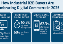
Should we be creating infographics?
When creating an infographic, the first question to consider is what it will be used for. What is your motivation for creating an infographic, and what is your goal?
If you answered ‘because everyone else is doing it and it might go viral,’ you are incorrect.
The correct response would be something along the lines of “we have this extremely intriguing, but complex data, and we want to convey it in a way that’s easy to understand.”
Perhaps you conducted a survey or would like to demonstrate a model or method. There are a variety of reasons why you might want to create an infographic. Make sure it’s about the data and not just for the sake of having an infographic. At the end of the day, it’s nothing more than a tool for exchanging information. Don’t try to force it.
When may an infographic be appropriate?
- When it’s easier to show something visually than write about it
- When you have a clear purpose
- When the information you want to spread is genuinely interesting
- When you can ensure the end result will be excellent quality
- When you have the budget to do all the above
Types of infographic
There are different types of infographics, depending on the information you may want to show. Let’s look at a few examples:
A timeline
Perhaps you wish to show information in chronological order. These are the infographics that will guide you down a road – usually time-related (obviously) – that will answer your questions about “who,” “what,” and “when.”
Relationships / hierarchies / structures
It might be difficult to quickly and properly describe how things are related to one another. Infographics can aid in the comprehension of such data. One example might be a company’s organizational chart (organigram). It could depict the overall structure as well as the relationships between job positions.
Making sense of data
Data can be presented in a variety of ways, displaying everything from patterns to trends and forecasts. Numbers always tell a story, but to make sense of them, they must be interpreted. That’s what an infographic does for you. Some visualizations will be more effective than others. As a general rule, it’s best to adhere to tried-and-true techniques of displaying data rather than trying something altogether new. Keep in mind that you want your infographic to be understood first and foremost. The Data Visualisation Catalogue has an excellent summary of the most prevalent approaches to showing data.
Describing the abstract
Processes, plans, and concepts might be difficult to articulate or convey in words at times. It may be the simplest method to convey the abstract concept if you take a step back and contemplate how to portray it graphically. For example, an infographic that walks the viewer through the process step-by-step could be a simple yet effective method to deliver a ‘How to Guide’ (think Ikea instruction manual).
What’s inside – describing contents
How something is built – the elements that go together to make it – is another type of information that lends itself nicely to visual representation. If we can’t look inside an object, an infographic can help us do so by breaking it open and explaining what’s going on within.
Gathering of information
Less inspiring are lists of information, but in certain instances, a list-style infographic can work well. Just make sure there are some strong visual elements used as part of the design, such as a visual representation of some of the items on the list.


