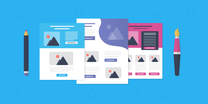
Landing pages are web pages where you direct a person to go after viewing your message/offer. The landing page can be your website, but can also be any other page on your website. This page has one sole purpose of conversion. Conversion of prospects to clients. Here first impressions matter the most. This webpage should be user-friendly and should be able to help you close a deal.
We, humans, grasp visuals faster than text, making sure your landing page is attractive. You can make use of videos too on your page. A few guidelines will help you get a better and attractive landing page;
- Headline: It is the first thing people will notice on your webpage. The headline has to be compelling and captivating.
- Sub-headline: You want to educate your prospects about your product or service. Your sub-headline will do the needful. The context should support the main headline.
- Visuals: Since the human mind is more attracted to visuals, your landing page should have one catchy graphic.
- Testimonials: Let your work speak for itself here. People usually are more convinced at buying something when they have positive client reviews. Uploading client reviews will help a prospect to make a decision. You can develop a good brand value as well as build credibility with your prospects.
- Call to Action: This is the most important aspect of your landing page. All your hard work of creating a landing page is for this. Make sure your call to action is of a different color than the rest of your webpage. It has to be the biggest in font and be attractive.
A landing page should compel a prospect to share its data and to take them to the final part of the process. One might need a lot of trial and errors to get to know what works best for your company. Keep changing the wording on your call to action buttons and see what works best for you.


